Mumbai Live started in 2016 with one aim - Bring everything Mumbai to the digital world. Like every startup, we learnt, evolved, grew and eventually decided the time was right for a complete redesign because the product was ready for version 2.0. The clothes have changed, our feelings haven't. Before we get to why and how we went about creating a completely different avatar, let's look at how the logo and brand evolved.
Our first logo lasted less than 4 months. Why? Because it did not convey everything we were. It didn't say anything about who we are or what we do or what kind of personality we have. A classic mistake of rushing into your branding because things need to get rolling. I mean, that's what a last-ditch effort to bang out some logo for the sake of the website and app gets you. We did this in 45 minutes flat, gladly without a designer or any kind of design process.
![]()
With the logo out, the next thing was the website design. And as you guessed, like the logo, it was more of what was served rather than what was thought, planned or ordered. We accepted what an outsourced tech team gave us and bam! Mumbai Live was born. At least for us.
We soon realized the value in positioning our name with something that spoke on our behalf - a local website and app that covers every aspect of the city. That brief took the shape of a pin with an eye. This was way more in line with what we were doing at Mumbai Live - creating content about the daily updates in Mumbai, reporting the 'breaking stories' of the day and giving our users an overview of Mumbai specific news.
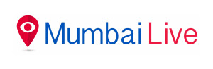
The pin indicated location specific to an area(Mumbai) and the detailed eye within it Mumbai Live's constant lookout for the happenings in the city, while the bold red colour complemented the news feel. With that came a strong tagline, "Your right to know, right now!"
This time, a little more thought out, a little more planned, but still hurried in the efforts and thoughts behind it. However, it was never fully 'us'. It was a part of our growth journey and hence deserves its place here. Especially because a lot of our users learnt to like it.
From day zero we wanted to do more than just news. We did not want to operate in a space where: a) there were enough well-known and big players whom we knew we could not displace; and b) give the same old stuff to our readers, which they could get elsewhere. Therefore, generating sensational stories or clickbaity articles that die out faster than the next one gets published made no sense. We were quick to realise what we wanted to focus on, and it was definitely not 'News' as you see it.
A typical media house focusses on:
While we're guilty of some of this too, we've always wondered if this is what the average Mumbaikar needs. And it's precisely this thought that got us here.
What Mumbai Live brings to you:
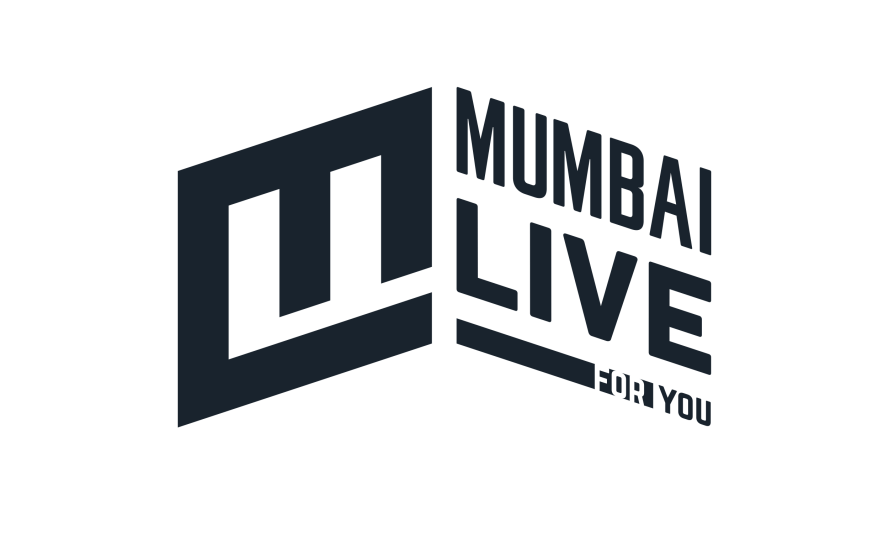
To put it simply, we want to talk about the city and its people and their unique connection. And to build a brand around this we need a logo that resonates with it. A logo that has an element of the city itself, is modern enough to support a digital brand and with hints of the words Mumbai & Live in it. The one major feature we wanted to capture in the logo was our audience, you- the people of Bombay, who make this city happen.
This time, we had no deadlines set, we gave ourselves a bit of breathing space and promised to adhere to the documented, right approach. This started with our Creative Head, Kushang Dholakia giving us a questionnaire that served as a starting point of our re-branding process. Answering those basic questions is the hardest and makes you introspect thoroughly.
Not only did it give him words to associate the brand with, but it synced our abstract thoughts into something more concrete. Writing helps, you know. It wasn't over a single ad-hoc meeting or a week-long design sprint that we locked down the logo; it took months. Like I said, we gave ourselves time. To be honest, we were just never satisfied. Never Settle for something you have to live with.
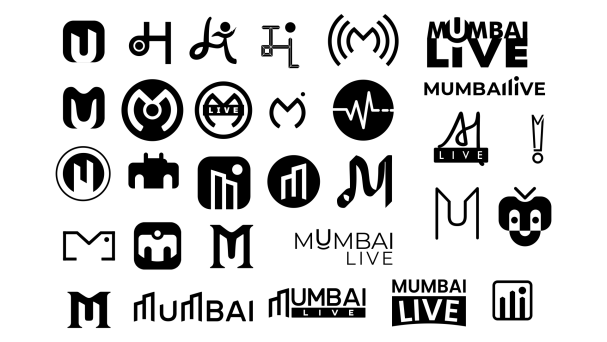
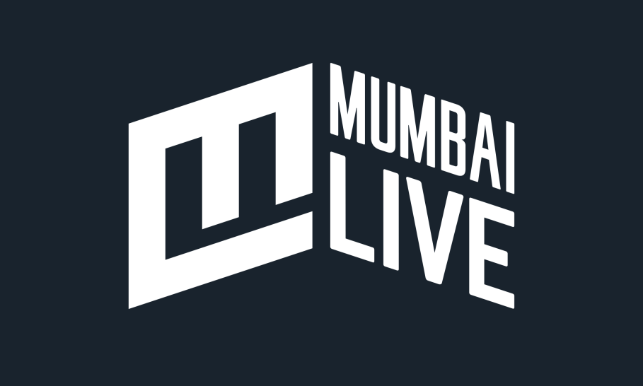
Through endless analysis, hallways tests and 'this one is final' discussions, bruised but wiser, we arrived at something that convinced us truly of Mumbai Live 2.0. A logo that we believe is new-age, digital, 'not only news', city and has our titles. Most importantly, it gives prominence you 'u', our readers.
In pursuit of finding 'the perfect colour' that is classy, neutral, visible and not over-used, we flirted with a lot of gradients, typical reds and blues and more before falling for #19232D. It's black but not really black. More like dark gray with a blue tinge to it, hence for us, it is 'off black'. And we love it. And you will too.
Now, a young company ought to put its brand name alongside the logo for better association and brand recall. But a simple Mumbai Live next to this logo just didn't cut it for us. So a bold, capitalised text written in Norwester made the name just as cool as the logo. The font is easily readable and neutralises the all caps(and our sharp logo) with its subtle, rounded corners. Moreover, it makes for a solid type to put up on any digital creative or billboard.
Finally, we put it through Paul Rand's logo test (as should you, if you're ever creating a new logo), to be sure that we weren't off target. And while most of the questions in this test are subjective, our overall ratings definitely more than just met expectations.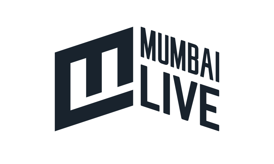
There was no such plan for a tagline and honestly unless you're a Pepsi, Nike or the like, who even remembers a I'm lovin' it or even cares for it. But since we are super sure that Mumbai Live 2.0 focusses on Mumbai and its people, we might as well make it known. With a target to use not more than 4 words, and absolutely, whacky $**t later, we came up with a simple - for you.
As a practice and philosophy at Mumbai Live, the new version of us will make you the focus, write articles about your problems, make videos about your celebrations and highlight everything in Bombay that deserves to be spoken about.
While we'll still do a lot of what we did these past two years, we'll try and do it better and create content that's more valuable for our users. After all, you make this city happen, you make Mumbai Live happen.